
Case Study: Bid Pro

Client: BidPro mobile app is an eCommerce marketplace that aims to connect millennial renters and homeowners to local home service professionals
Role: UX Designer
Tools: Sketch, Axure, InVision, Keynote, & paper prototypes
Timeframe: 4 Weeks
Challenge
To create a seamless end to end user flow that takes into account usability along with BidPro’s key market differentiators:
Project bid processes
Peer to peer reviews and service pro referrals
Service transaction experience
Space in the Marketplace?
In order to understand the space that the BidPro app was existing in, it was important that we research the key direct and indirect competitors.
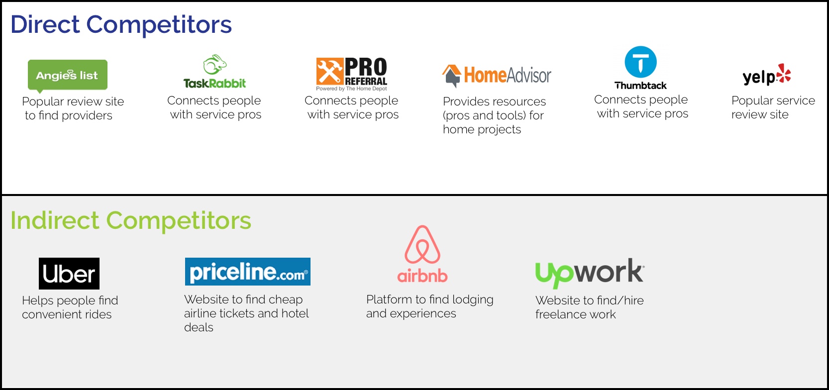
We researched six direct competitors along with four indirect competitors to better understand the competitive landscape
Client Alignment
We analyzed a total of sixteen metrics. The ones we gained the most insight from were payment processes, user reviews, services offered, and notable features. We learned that the landscape BidPro was competing in was fairly saturated with apps offering similar services. Thus, it was important that our research, ideation, and user testing really help BidPro to identify ways it can stand out in the market. In addition, we researched the domains of ecommerce marketplace trends, the sharing economy, and platform leakage. Notably, by researching platform leakage we were able to identify practical design solutions to pass onto our client for consideration.
Our goal for our first client meeting was to better understand our client’s needs and constraints and help them to better understand the UX process. Prior to moving forward, it was important that we align with our client on how to best do that. We achieved alignment through a value map activity we did with them. The value map activity helped us to identify how our client envisioned their values being incorporated into the app.

Here are our clients participating in an activity that helped us to align on our project goals and expectations
We conducted user interviews in order to add to our understanding of the app’s environment and the potential constraints the app would be facing. Originally, we had set out to just interview those the client provided to us - millennial homeowners who would use the app to hire service pros. However, to make our research more robust I pushed for interviewing SMEs who were service professionals in the gig economy space with experience using similar apps. We took all of our user interview insights and synthesized them with an affinity map. Color coding helped us to better visualize the information and allowed us to draw connections easily.
Users have expectations outside of job completion - Users expected pros to not only do a quality job but also showcase professionalism with punctuality, transparency, and communication
Photos encourage trust in the provider - Users like to see proof of quality work through photo evidence
Users don’t trust the name your price feature in apps/online -The Priceline name your price feature wasn’t received well by users as they expected to receive a low quality offer or believe it to be too good to be true
Users use reviews but don’t often write them - Users are apt to use and read reviews however it takes a lot for them to leave one
The results from our affinity diagram helped us to gather our design principles and problem statement.
Millennial homeowners need a digital tool that provides transparency, through clear communication, in the process of researching and hiring service providers because they want service providers who align with their expectations.
Design Principles
Reduce Friction:
The app needs to demonstrate a seamless experience to encourage positive feedback and future use.
Build Confidence: Users should be confident in the value of the service providers they find, in order to feel empowered to make an informed decision.
Partner in the Process: While using the app, users need to be informed during each step in order to promote inclusion and trust.

Our primary persona Nigel
Upon meeting with our client again, they were pleased with our efforts in conducting user interviews and were interested to hear about what our SMEs had to say.
However, we received some pushback on our thoughts on peer to peer messaging as our client felt we ought to reconsider testing it, despite the initial lack of interest expressed from our interview participants. We decided to move forward with their suggestion because they felt strongly in it being a differentiating feature for their app.
It was important to me that the client understand the purpose of concept testing in the UX process. In order for them to feel like they are a part of the process and to help prevent misalignment down the road.
During a later meeting with the client we had them prioritize what three concepts they wanted to test, because we were facing the challenge of limited time to complete the necessary UX processes. Upon some discussion our clients prioritized three concepts to us out of all the potential options.
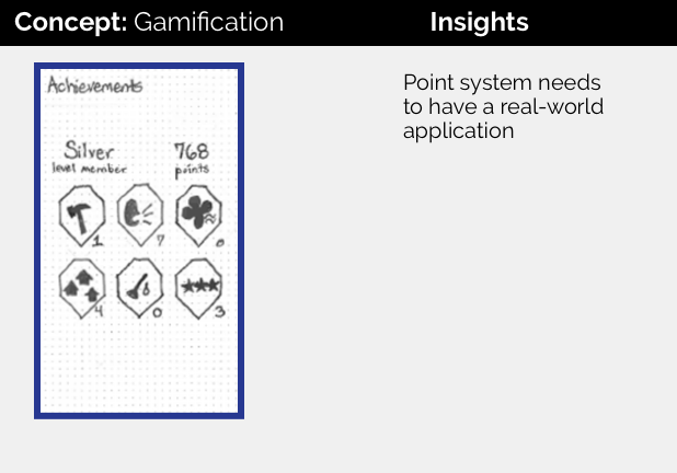
Low Fidelity Client Prioritized Concepts


However, despite initially stating we could only test three concepts we felt it was important that we exceed their expectations. We decided to test additional concepts that were brought up from our user interviews and research.
Low Fidelity User Influenced Concepts


We encountered some surprises along with some validating results that resulted from our concept testing.
We used our concept testing results to inform how we built out our wireframes. More specifically, the concepts that tested well we incorporated into our wireframes. While the ones that either required further testing or didn’t test well, we didn’t include in the creation of our wireframes.

This is just one of many flows
Once we had a complete end to end flow built, we then used it to conduct usability tests.
We used the feedback from our observations and questions and translated it into actionable items that we used to guide our wireframe iterations.
End-to-End Solution
Upon completion of the updated prototype we now felt we had a ready MVP to present to our client. Our MVP provided an end to end flow that allowed the client to move to the next stage of development. Our solution incorporated key features such as the ability to find, message, book, and review pros. It also allows for peer-to-peer communication along with the option to view posts of what other users in the neighborhood are up to.
Our final meeting with our client went well as they were pleased with what we had to provide them. The most exciting part was that our client even pivoted the direction of their app based on our findings. That pivot being exemplified in our research for utilizing a “hyperlocal” feel where users can leverage their local community to find service pros.
Future Considerations
It was important for us to ensure that our client was prepared to move forward. Demonstrated in a synthesis of future considerations we handed to them. Some of the considerations were - additional testing on the current wireframes, further research and testing on providers, developing a walkthrough and onboarding flow, and hiring a content strategist for the creation of the provider attribute tags.
Lessons Learned
Reconsidering Client’s Request
Initially we got mixed reviews from users about our peer-to-peer messaging but because we got pushback from our client we decided to reconsider and test it again. After testing it again we got more promising feedback which the client was pleased to see.
Explaining the Importance of an MVP
The client wasn’t clear on what an MVP was and it was important that we explain why it was important and how it is essentially enough to move forward. By the client understanding an MVP, they would know that later it would require further testing thus encouraging further iterative processes.
Appreciation for Concept Testing
Initially when concept testing I was hesitant on the importance of it but knew it was a well established practice. Had we not done concept testing then we wouldn’t have found out certain points as easily. Such as that users rather browse instead of starting a project when finding a pro. Also, it was through concept testing that we learned the community feed was a promising aspect to move forward with.
Only Include Tested Features
There were times when it made sense to include flows that we could easily find a template for. But, because we hadn’t tested those flows prior it wasn’t viable enough to include putting into the MVP.
Balancing Client Needs with User Needs
During this project, I learned persuasive strategies in presenting the users need in a way that framed it as a client need as well.
Iterative Communication
It is helpful to present patterns in the research and user data in a clear and repetitive way to the client, as it helps them to gain trust with moving in a user centered direction.