
Case Study: Explore

Client: Explore Interactive!
Role: UX Designer
Tools: Sketch, Axure, InVision, Keynote, & Paper Prototypes
Timeframe: 4 weeks
Context
The Explore app utilizes augmented reality to enhance and engage STEM understanding for students in the 3rd - 6th grade. The experience involves placing cards with STEM visual components, in front of the screen to complete challenges. By using and moving the cards in front of the screen students are able to be part of an immersive educational experience.
Challenge
Our team was tasked with the challenge of improving the usability and onboarding experience of the Explore! STEM education app. While, identifying ways to incorporate storytelling, engagement, and multi-user functionality.
Understanding the Space
In order for us to gain an understanding of the app’s environment it was important that we research the competitors. By researching the competitive landscape we gained a better understanding of the areas where it could afford to gain a stronger position. We realized in order to stay competitive, it needed to increase its entertainment factor while maintaining its education focus.
Our research helped us to realize that we needed to create an on boarding experience where students feel fully immersed and don’t even realize they’re learning.
Not only did we research the competitors, but we also looked into related areas that we could gain potential insight from.
Areas Researched
STEM
Augmented Reality
Child psychology
Storytelling
Gamification
Video game design
ISTE standards
Current game trends.
Upon gaining this information we were more aware of the competitive landscape and better informed to compose our user interview questions.
Research Findings

Conversations with Teachers, Students, and Tech Ed Specialists
The first round of user interviews consisted of primarily teachers, students, and a classroom tech education specialist. We asked them questions related to the classroom, school, technology proficiency, along with their hobbies and preferences.
Thematic Insights
Students love games that incorporate a story element
Students prefer to work at their own pace
Teachers like to receive actionable data on a student’s progress
User Quotes
““She makes a point to not give us the answers, she lets us figure it out on our own” - 5th grader ”
““Through the app I could essentially see how many minutes they completed and how much they progressed” - 6th grade teacher ”
Patterns in the Data
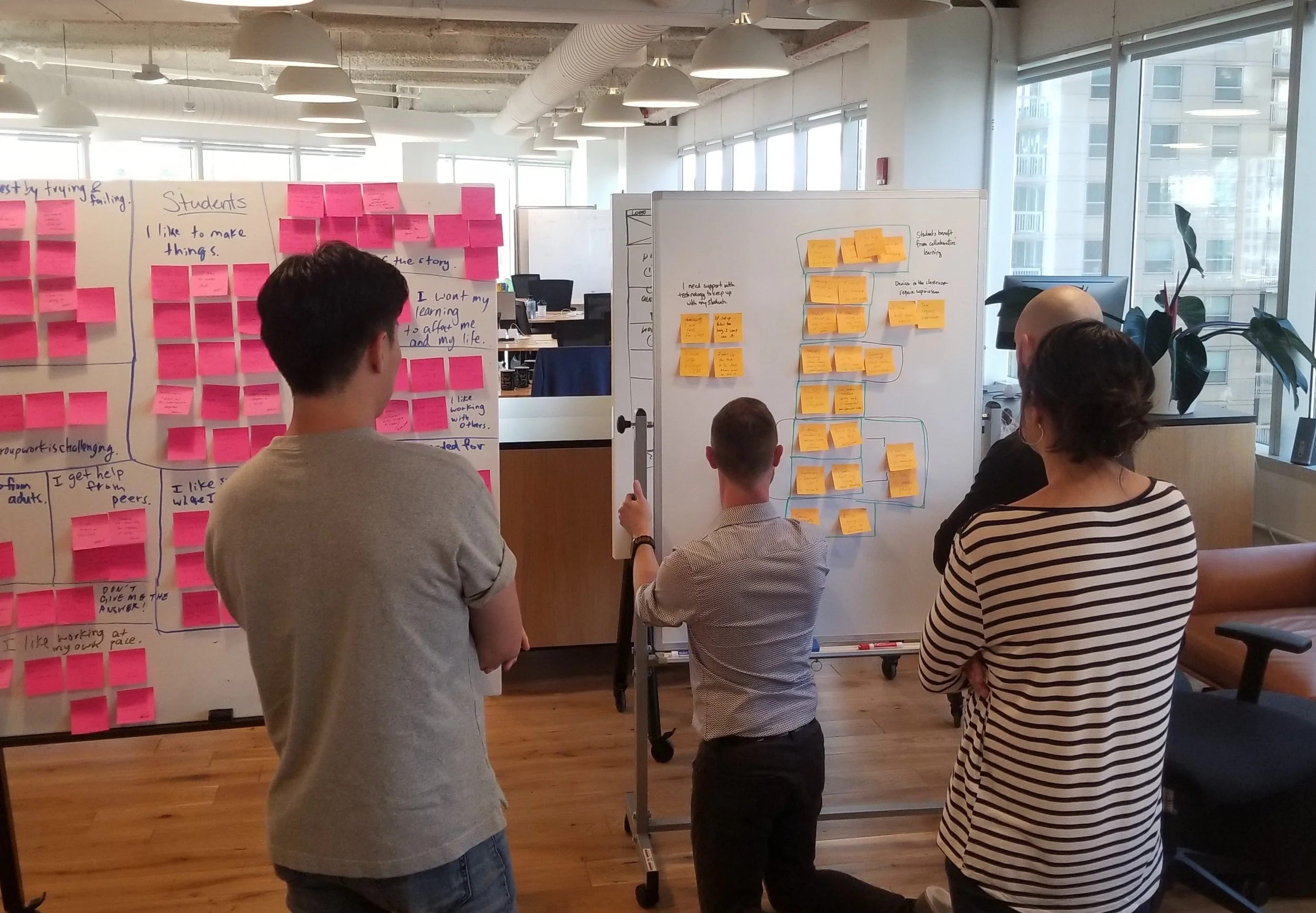
Through our affinity diagram we were able to identify our design principles, personas, and the beginnings of the problem statement
Students and teachers involved in STEM education need a hands-on learning tool in order to increase:
- Engagement
- Self-directed learning
- Measurable outcomes
Encourage Perseverance:
The design should anticipate the need for help and embolden the user to learn by experimentation
Immerse the User: Through stortyelling, the user is engaged and feels part of the game
Make Learning Demonstrable: The design gives students and teachers measurable markers for success
Adapt to Varying Proficiencies: The design should support all users and promote exploratory and self-directed learning
The synthesis of the information gained from user interviews helped us to understand who the app would be solving for, which was, primarily students and teachers. Which led us to create our student, primary persona and our secondary, teacher persona . By keeping these two personas in mind we felt much more prepared to move forward with our process.

Our primary persona Juan, the student

Our secondary persona Amina, the teacher
Idea and Concept Creation
Using the feedback we got from our user interviews along with our research, we came up with concepts that the app could incorporate. These concepts would be the building blocks for future features.

It was challenging for our team to tackle concept testing as none of us had ever concept tested before. We learned that we should have time boxed it from the start as it was hard to pick and choose concepts. The concepts that tested well we incorporated into our AR prototype. Prototyping with AR was new to us, so we were all eager to brainstorm ways to prototype.

We explored a method where we cut out frames and pasted pieces on clear sticks, that would essentially pop into the fake tablet screen, as if it were augmented reality. We also looked into various AR prototyping software but found them to be too early in development and limited in what they could achieve. We ended up using what we knew, the software Axure. We demonstrated an AR like experience with the use of hidden hotspots and a realistic background.

We took the iterated prototype and presented it to another round of students. But this time, in person, at a science fair held in a nearby town. After receiving approval from the student’s parents we went ahead and tested our prototypes on them.

Myself, participating in a concept test with a student at the PopUP science fair
The students provided us with a lot of insightful information. Such as, how they would rather receive a hint than ask a teacher for help, and that they like being able to customize and make the avatar their own. Once we received the necessary feedback from our prototype testing, we were able to move forward with creating another updated version that incorporated the feedback gained from the previous testing.
Press Play for the Prototype
In the final MVP version for our client, we considered both the client’s needs along with the insights gained from research and testing. In order to incorporate the ownership lesson gained from concept and user testing, we made sure to include a key action where the user had to build the main robot character, Atom. As a way for users to not only learn how to drag and drop, but also feel ownership while building Atom. In addition, we wanted the user to quickly be a part of the mission, achieved through integrating an exciting storyline and having them use the AR feature right away. Upon completion, we got a lot of feedback from users stating how they wanted to continue playing after onboarding!
Prototype Video

Press play to see a video of our onboarding solution
User Feedback
Make AR interaction clearer
Incorporating “drag and drop” before build mode
Include more markers for success
Once we organized all our results, we put together annotated wireframes, finalized our deliverables, and synthesized our future considerations.
Future Considerations
Atom as Help
It would be worth exploring ways to increase activity with the main character Atom. Especially, testing him as a help component, where users could select him when they are stuck.
Incorporating Teachers
It’s worth considering more functionality for teachers. Such as a dashboard, where teachers can view and measure students progress.
Return to Onboarding
Although, we were trying to make the onboarding experience as engaging, immersive, and informative as possible for students, it’s important that students have the option to return to onboarding if they need. This would help solidify understanding of the instructions and allow further adaptivity for those students that need more time.
Accessibility
It’s important to take into account the diversity of students in the classroom. Due to the variety of learning and accessibility levels, we strongly encourage a settings option that could include more text on the screen along with audio.
Final Reflections

Our team participating in a weekly debrief, where we went over areas that went well, could be improved, and noteworthy mentions of praise for each team member
Task Flows Sooner
When we got to the point of prototyping we were unsure how to begin creating the necessary wireframes. Mainly because we weren’t sure how it would look. It was at this point that we realized, had we made a task flow prior, then building the wireframes would have been easier.
Communicate more with Stakeholders
We had limited time with our stakeholders and thus wish we would have had more opportunities to communicate with them. This would have prevented moments of miscommunication in what was expected as well as ensured a more fluid and natural process. In addition, it’s important to make sure both sides are aligned throughout the process since communication is paramount!
Revisit the Brief
We made the mistake of not spending enough time on the brief at the beginning. We could have immensely benefited in spending more time on it from the start and being intentional about revisiting it.
Documents are Alive
Upon completion of deliverables we would typically turn it in and take it off our minds. Wrong! We should have treated our deliverables like living documents. Where we revisit and edit them throughout the process.
Timebox Concept Testing
Our team got a bit lost in our concept testing process and found ourselves going in circles more so than we would have hoped. We should have made a point to start with clear objectives along with time boxing the time spent on the activity.